


A Run Chart is a graph of variable data over time. For example, the number of referrals generated by your practice each week, the number of opiate prescription issue per month or the number of ‘extra patients’ seen per day.
The run chart shows visually how the data varies so that you can start to understand the normal pattern. This understanding is important if you are hoping to generate changes as you will need to know if improvements are genuine or if they are part of normal (or ‘common cause’) variation.
Download RCGP Quick guide: Run charts
Here is an example of a run chart of the number antibiotic prescriptions issued per week
The orange line on the Run chart is the median number of antibiotic prescriptions issued per week.
It’s clear from the run chart above that the number of extras is highly variable. If you are trying to change your practice processes to reduce the number of extras, then you need to understand the normal variation so you can tell if your intervention has worked. This median line is important and needs to be ‘fixed’ on your run chart before you introduce a change that is designed to improve things. Following your intervention you continue to plot your data and the chart will allow you to determine if your change has worked.
How to
This worked example demonstrates how to use a run chart. A basic knowledge of MS Excel, alongside the useful tips in this document, are all that are needed to create a run chart. However, to make this even easier, the Institute for Healthcare Improvement USA (IHI), have created an Excel template. To access this template you will need to register with the IHI, but this is free and straightforward. It is best to gather at least 15 days of data before constructing your chart.
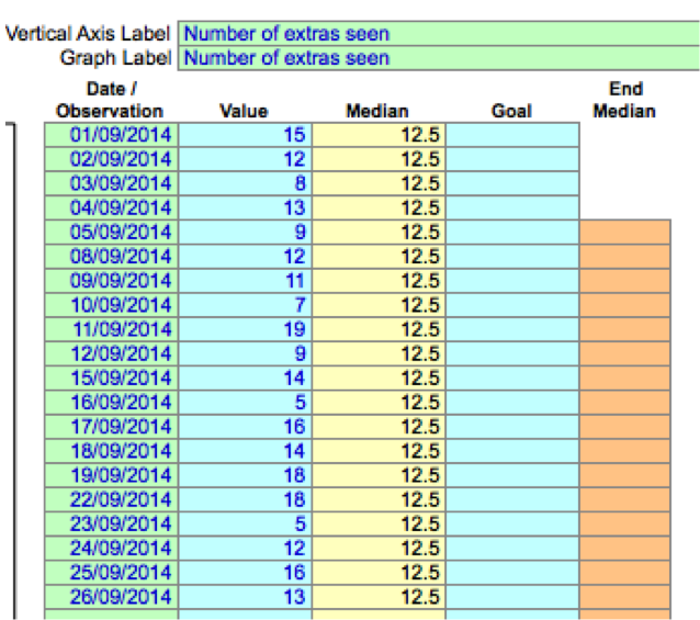
In our example, the lead receptionist gathers data about the number of extra patients seen over four weeks (20 working days). This is inputted into the IHI spreadsheet: dates in the left-hand column and the numbers seen in the ‘value’ column.
The spreadsheet is illustrated below
The IHI template automatically calculates the median number of extras and creates the run chart shown below
The median line is drawn on the chart in order to help you check whether the data is random or not. You will need to know that it is random variation so that you can make sense of any changes that happen when you experiment with a new way of doing things (which can be called a ‘QI intervention’).
How to tell if the data is random
It is important to check that your baseline data shows random variation. If the variation is not random it may be that there are already things happening to change it (for example a media campaign) and this will prevent you identifying if changes you may see later are being caused by your intervention, or by something else.
If your data is random:
- The graph line crosses the median line frequently. This makes it more likely that the data is random.
- There are no ‘trends’ (five or more data points going up or down).
- There are no ‘shifts’ (six or more points in a row either above or below the median line).
- The number of runs in a chart are within the expected lower and upper limits (next page).
Expected number of runs
If your data is random, there is an expected lower limit and upper limit of runs you should expect to see for the number of data points you have collected, as illustrated by the table below. Too few or too many runs may mean that your process is already changing. This will make it hard to know if your project is successful and will require investigation before embarking on your project.
| Number of data points (In our example number of days we surveyed) | Lower Limit for Number of Runs | Upper Limit for Number of Runs |
|---|---|---|
| 10 | 3 | 8 |
| 11 | 3 | 9 |
| 12 | 3 | 10 |
| 13 | 4 | 10 |
| 14 | 4 | 11 |
| 15 | 4 | 12 |
| 16 | 5 | 12 |
| 17 | 5 | 13 |
| 18 | 6 | 13 |
| 18 | 6 | 14 |
| 20 | 6 | 15 |
| 21 | 7 | 15 |
| 22 | 7 | 16 |
| 23 | 8 | 16 |
| 24 | 8 | 17 |
| 25 | 9 | 17 |
| 26 | 9 | 18 |
| 27 | 9 | 19 |
| 28 | 10 | 19 |
| 29 | 10 | 20 |
| 30 | 11 | 20 |
| 31 | 11 | 21 |
| 32 | 11 | 22 |
| 33 | 11 | 22 |
| 34 | 12 | 23 |
| 35 | 13 | 23 |
| 36 | 13 | 24 |
| 37 | 13 | 25 |
| 38 | 14 | 25 |
| 39 | 14 | 26 |
| 40 | 15 | 26 |

In our example, the number of data points will be the number of days surveyed, which was 20 days. If we look at the table, for 20 data points, we should expect between six to 15 runs if the data is random. Our example has 11 runs with no shifts or trends and so it does seem to be random variation.
Next Steps
The practice has now gathered its baseline data and decided that the variation is random. They would like to reduce the number of extras seen in the surgery.
The first experiment is a GP telephone triage of all requests for same-day appointments. This involves significant change to the working day for the GPs and has the potential for fewer routine appointments as a GP. However it is seen by the practice as an experiment and they are confident that the run chart will help them to see if it makes a difference.
They continue to gather the data and input it into the spreadsheet. On the spreadsheet template they mark with a ‘X’ the last number from the baseline data. This ‘freezes’ the median. Everything after this point came following the introduction of GP telephone triage for same day appointment requests (‘the intervention’).
So what happened?
Here is the chart that was created by the IHI Excel template once the new data was inputted
This graph shows that all the data points collected after the intervention fall on one side of the median. There is only one run and there has been a definite shift (more than six points consecutively on one side of the median). As the shift coincided with the intervention it tells the team that the intervention has generated a change.
